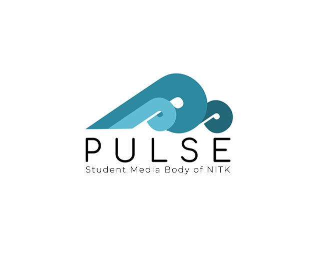
When I was first approached to design a logo for Pulse, I was excited to take up the chance to contribute to such an interesting and impactful project for our campus and community. I was required to create something simple, recognizable and representative of the themes of Pulse and NITK. I set out to design a logo which could stand the test of time, with as much meaning and significance as I could put into a basic form.
I started by looking into the idea of a wordmark, or a typographic logo. Initially I wanted to create something involving a sans-serif letter “P”. During my initial experimentation phase I realised that placing a P horizontally created the rough shape of a cresting wave, and suddenly I had a place to start. Waves are pulses of water, after all, and for a college by the sea, it seemed appropriate. This happy accident set off a flow of experimentation, and after several modifications to existing typefaces, I landed on the current form. Then came composition and colour. In an attempt to create the appearance of “pulsing” waves I replicated the form several times, did some scaling and played with composition until I was happy with how they fit together. Finally, colour. The natural choice of blue, with its connotations of trust, wisdom, confidence, intelligence, faith and truth was perfect for a news media body.
And thus, the Pulse logo as you see it today emerged. The wave forms, apart from their direct reference to the sea and seaside where NITK is located, aim to represent the changing tides of opinion and events in college and the colour choice is connotative of values I feel are essential to honest and insightful reporting.
I had a great time working on this project, and am really grateful to the Pulse team for both giving me this opportunity as well as selecting my design.


